There is no
doubt that apps are more influential than ever in today's tech-conscious world.
With mobile devices now exceeding desktops in terms of the sheer number of
users, it is not surprising that mobile is now outpacing desktop usage.
A recent Pew
Research Center survey found that 68 percent of Americans own a smartphone, and
73% own a computer.
There has
been a nearly two-fold increase in the size of the first category since ten
years ago while the size of the second category has remained relatively constant.
There seems
to be a great deal of discussion today about the new mobile app that everyone
has downloaded from the Apple App Store.
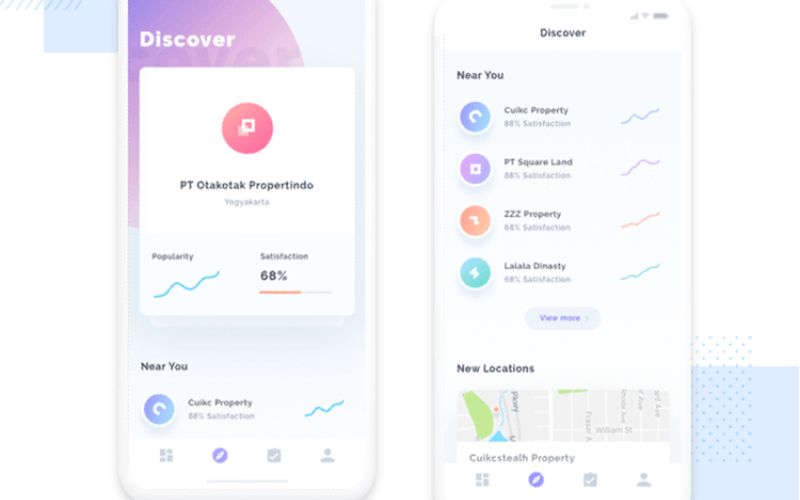
When
designing for mobile devices, it is essential that the user experience is
flawless, whether the device is being used by a customer, shopper, reader, etc.
When using
mobile devices, surfing the web presents a unique challenge due to their
smaller screens, their ability to be handled with just one hand, and the fact
that they are in motion.
In spite of
how sophisticated the tools you use for designing the app may be, the user
experience can make or break the entire application.
Introducing
these app design ideas to your app will significantly improve the user
experience.
Progressive onboarding
One of the
most important app design tips is considering progressive onboarding. In terms
of conversions and retention, it is crucial that your onboarding process
ensures that new users are shown that your application is effective, easy to
use, and functions as they wish.
A progressive
onboarding method is an excellent method for ensuring that users are not
overwhelmed by excessive requests for personal information, instead introducing
them gradually to your app so that they can get the most out of it as soon as
possible.
The progress
of the onboarding process is clearly communicated through tooltips and online
prompts, indicating that progressive onboarding is designed to be an immersive
learning experience that promotes adaptability, regardless of whether you are
examining it from a UX or UI perspective.
🔘 Read More: Types of Applications You Can Build With Node.js - 2022
Consider simpler menus
As the
screen of real estate on mobile phones is very small, you won't be able to
design very big fly-out menus that will be visible on a mobile device.
It will be
easier for your users to navigate your application if you have fewer layers of
navigation.
It may be
useful for you to place icons to represent your menu items onto the bottom tab
bar. Make sure that you use only the Facebook mobile application for
navigation. You want your customers to be able to navigate easily using their
thumbs.
Fluid layouts are popular
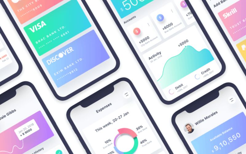
You can
think of it as a method of making your application responsive. Fluid layouts
guarantee that your application displays correctly on a variety of devices with
different screen sizes. Typical device widths include:
Your app
will only work on compatible devices if you do not establish breakpoints that
align with your app.
Any other
device would display the content in a terrible way and the user experience
would be greatly diminished, thus this is a critical issue.
Try to be predictable
Having a
clear understanding of how the user interface will allow them to predict how
their app will be used and interacted with. Take a look at these examples:
- The navigation
process consists of both a horizontal and a vertical component
- There is no
difficulty in seeing the icons and tapping them
- The thumb is an
effective tool for scrolling through content
It is a
design principle that has been around for a very long time and ensures an
awesome user experience given the fact that there is a lower margin of error.
Your app's
design can provide an indication of its outcome since it has been designed in
accordance with what your users expect.
The number of form fields should
be reduced
Design the
form in a manner that minimizes the number of unnecessary fields and the number
of optional fields.
By using
this technique, you will be able to improve the user experience of your
application, since your users will not be distracted by other distractions
before completing your forms, such as the ringing of their phones or other
notifications.
In designing
mobile forms, it is a well-tested rule to remove fields that are not directly
related to the task or goal the user is attempting to accomplish.
Design for one-handed use
According to
several studies, most app users operate their smartphones with one hand only
when operating an app. When designing mobile applications, it is imperative
that this be taken into account.
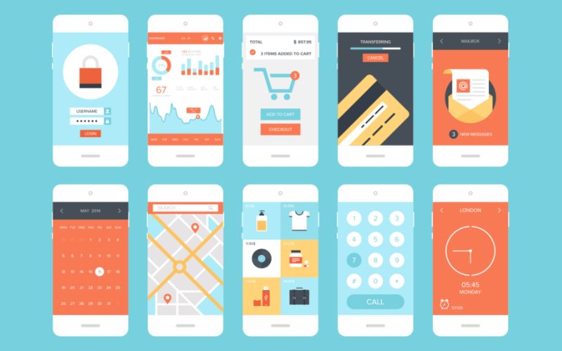
It is more
common for users to use one hand when using an app to complete simple tasks,
such as making a purchase or scrolling down for more news, rather than using
both hands.
In order to
optimize user experience, you must make your app simple to use even when a
person uses just one hand when browsing.
Asian audiences love red
items
It is
impossible to design a mobile app without taking the Asian market into
consideration, which is the world's largest market for mobile applications.
As a result,
ensuring that your user experience is sensitive to the sensitive needs of Asian
users is essential. What can you do to accomplish this?
It is
essential to understand how celebrations work in order to understand the
significance of color. Red is seen as a symbol of celebration, joy, and
happiness in many cultures.
As part of
your application's user interface, you should instead use quite a bit of red
rather than neutral or subdued colors.
Persuasion at checkout is
necessary
During the
checkout process, customers are more likely to abandon the process, so you
should devise a persuasion strategy to encourage them to complete it.
In order to
achieve your goals, you can adopt a variety of approaches:
- For free
delivery to apply, you must encourage more purchases from your users
- When you are
completing the checkout process, please mention that you offer a free return
policy.
- By displaying
such simple messages during the checkout process, you can increase engagement
with your site and increase conversion rates. persuasion at checkout is
necessary.
Skeleton screens for
progress
Users who
are using mobile devices should not concentrate on how long it takes to load
their page if you intend for them to do so.
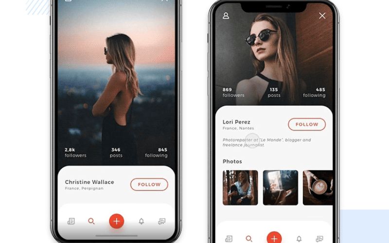
Using
skeleton screens with blank pages that slowly load content instead of a spinner
can actually frustrate the user. This way, the user can concentrate more on
what is actually happening, rather than the spinning circle.
A study
conducted by Google's Luke Wroblewski found users complained about the time it
takes for their page to load when using spinners. Therefore, you should use
skeleton screens in order to fool your users into believing that the UX is more
efficient.
Images for fancy effects
are out of date
A picture
that includes fancy effects such as shadows or gradients will have a negative
impact on the app's performance because the images consume a lot of resources.
Instead of utilizing fancy text as images in the design, make sure that text
remains just text.
The easiest
way to create fancy effects in your app design is to simply choose a fancy
typeface. Don't be concerned about adding unnecessary images to your design to
make it look more glamorous - it will speed up the loading process.
Motion and animation
An
International Consumer Research Center study indicates that animation and
motion design trends can enhance consumer engagement with content.
Animations
keep people's attention and encourage them to interact with the application by
providing them with a practical example of the information they are being
given.
An animation
trend provides a valuable tool for highlighting critical elements whenever
possible. For example, you may wish to enhance the intuitiveness and ease of
interaction with your application by animating the buttons.
You can
significantly enhance the quality of your application by implementing
micromovements like icon animation.
By adding an
animation to your app, you can highlight its features, increase conversion
rates, and even increase sales.
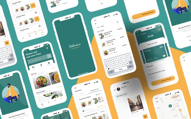
It is
therefore crucial to invest in advanced animation techniques in order to reach the
users of today since simple movements do not work anymore. Ensure that the
transitions in animation are elaborate and differentiated based on the target
audience.
Be consistent in design
Uneven
design is one of the most aggravating aspects of an app, as it causes users to
become confused while navigating the application, which ultimately leads to
frustration and abandonment if not addressed.
How would
in-app consistency look if we were talking about it?
- One of the
call-to-action buttons should have the same color as the others
- Sites that use
hamburger menus for navigation should have them available on every page
- If one screen
has 20 pixels of padding, the padding on all screens should be 20 pixels as well
Gestures and swiping
experiences
Mobile
devices, are more attractive than computers because of the gestures and swiping
they offer, as well as the excitement associated with swiping.
Our
smartphones have a number of buttons and additional features that can prove to
be bothersome and distracting. Every day, we use our smartphones to scroll,
swipe, and find new information.
Some app
developers even restrict the use of buttons in their applications due to the
recent development trend in app development.
With gesture
design, rather than buttons on the screen, swiping will replace them and reduce
the clutter on the screen.
It is
possible to add animation to swipe actions to improve the user's experience.
For example, book apps can turn pages through animation.
Conclusion
All in all,
there are so many various app design tools, app design apps, and app design
tips to consider. A good app developer is one who pays attention to all of them
together, to build the best possible app.
If you are
wondering how to boost your online presence and stand out among competitors, we
have a good solution for you: consider our app development team.
We have many
expert specialists who are able to help you with any service, including web,
desktop, android, and iOS application development. So do not hesitate and take
a look at our website.